

Summary
I designed a Summary screen that introduces cross-product comparison before results, helping users make travel decisions earlier.
The solution increased cross-user engagement by +7.7% and cross-purchases by +3.45% without impacting overall conversion or ARPU. It also became a key entry point for promoting high-margin products and enabled bundled offers.
Context: Why this problem matters
Tutu is evolving from a transport booking service into a travel marketplace that includes flights, trains, buses, hotels, and more.
However, the experience was fragmented. Users typically entered through a single product and stayed within that category. There was no natural way to compare different travel options or discover complementary products.
This limited cross-sell opportunities and reduced decision quality, as users had to manually explore alternatives across different searches.
Problem statement
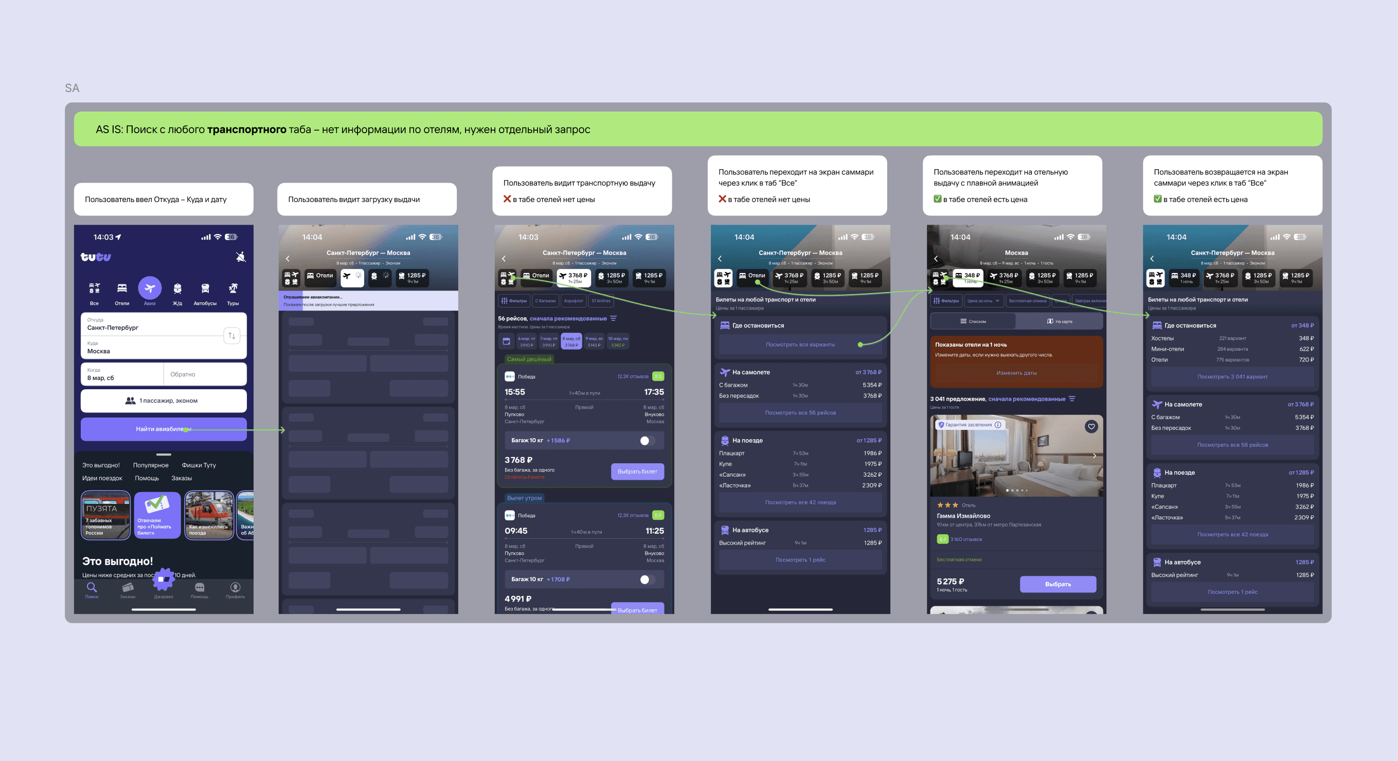
After entering search parameters, users were taken directly to a single-product results page. This prevented them from seeing alternative ways to complete their trip and led to suboptimal decisions.
At the same time, introducing an additional step in this high-traffic part of the funnel posed a significant risk. Any added friction could negatively impact conversion.
The challenge was to introduce comparison and product discovery without impacting core metrics.
UX research
To validate the concept, we conducted qualitative research combining in-depth interviews and moderated UX testing.
We tested interactive prototypes of different Summary concepts on desktop (due to technical limitations of mobile prototypes). The study included 9 participants: a mix of Tutu users and users of competing services, all with recent experience booking transport online.
Participants were given realistic travel scenarios (both familiar and unfamiliar routes) and asked to start a search from different entry points, evaluate options on the Summary screen, and explain how they make decisions and what influences their choice.
This allowed us to observe how users choose transport, whether they are willing to switch between options, how Summary affects their decision-making, and how they perceive additional elements like hotels.
We tested multiple concept directions, including content-heavy screens and offer aggregators. These approaches consistently underperformed, as users felt distracted from their main task and described the screens as overloaded or promotional.
We also iterated on information density and visual presentation. Through testing, we identified the minimal set of attributes required for comparison and validated that photographic representations improve recognition compared to icons.
Key Insights
Users approach travel search with a predefined preference but are willing to switch if presented with a better option. Summary creates value by enabling this comparison early in the journey.
The core decision model is based on time and price, evaluated across the entire journey, not just within a single transport.
Summary is perceived as a useful comparison layer that helps users understand available options and discover alternatives.
However, its usefulness depends on speed. If users are confident, they quickly scan the screen and move forward, which makes it critical to keep the experience non-blocking.
Content beyond transport options is perceived as irrelevant and distracting at this stage.
Cross-sell elements such as hotels are not expected during transport selection and can reduce trust if perceived as intrusive. They work better when contextual and bundled with clear value.
Clarity of wording directly affects trust. Ambiguous labels create confusion and reduce confidence in the system.
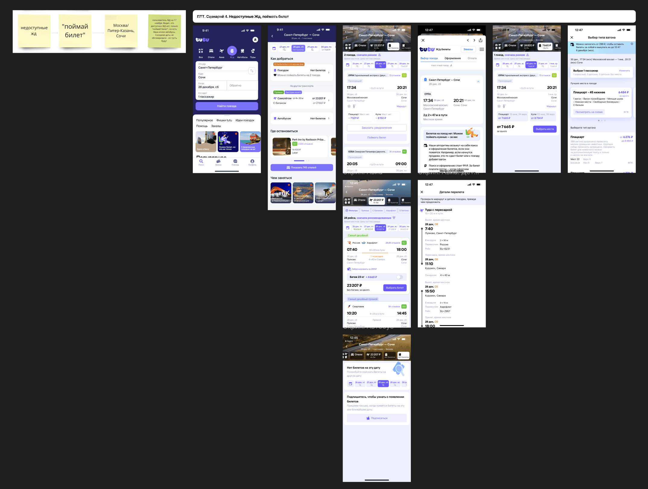
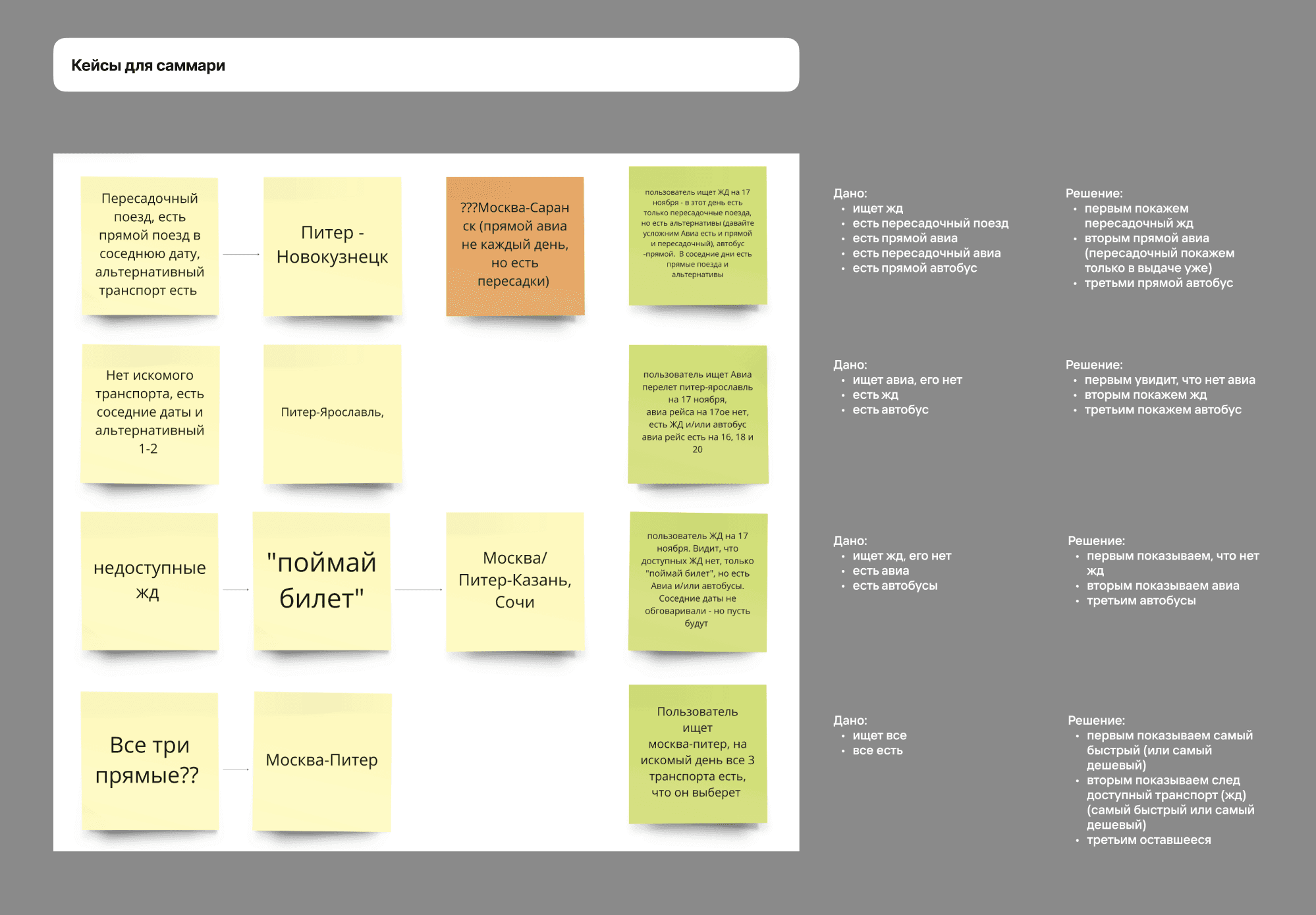
As a result, all the cases for summary page were defined and selected based on insights we had during interviews.
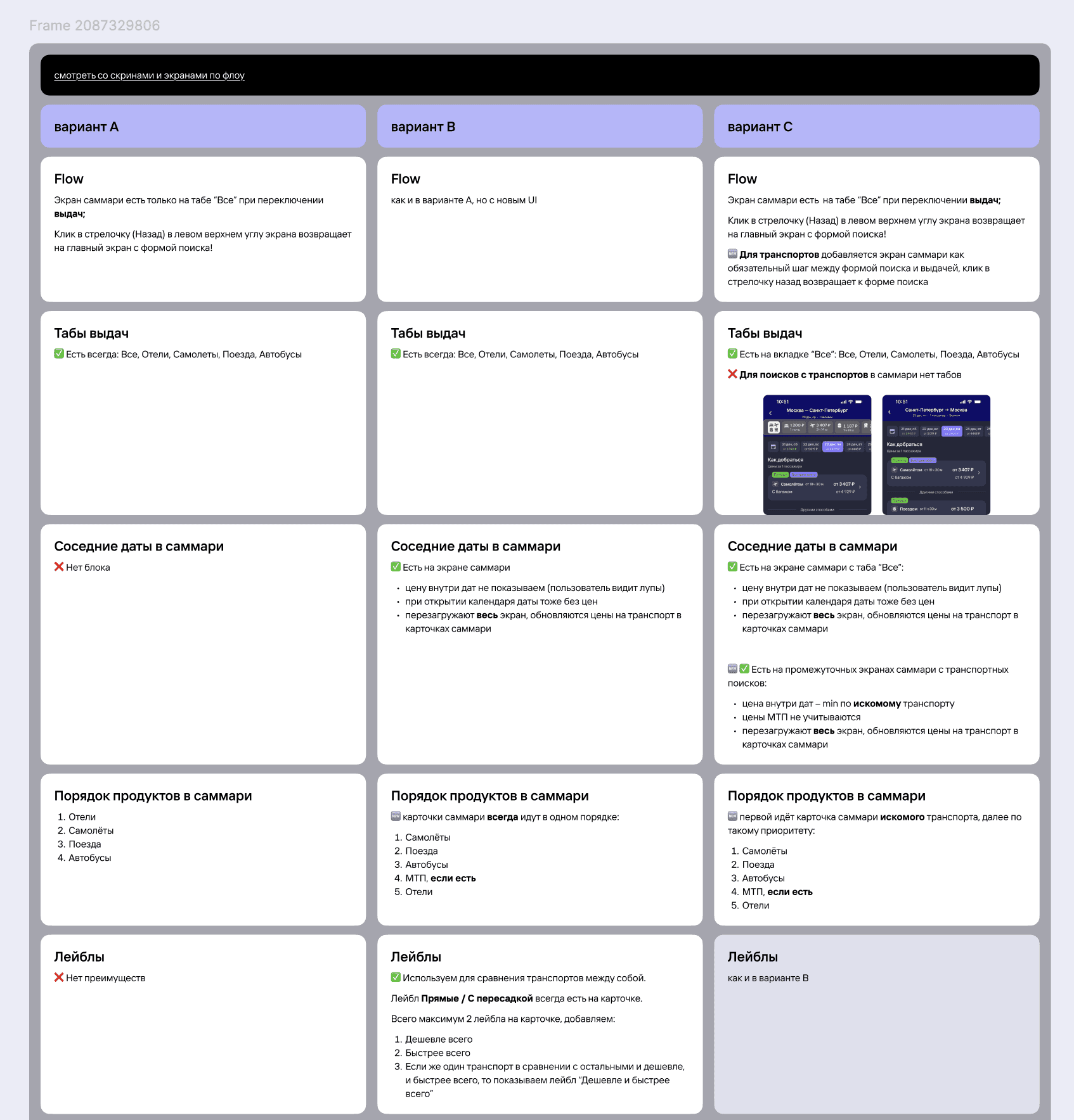
Decision (scope and trade-offs)
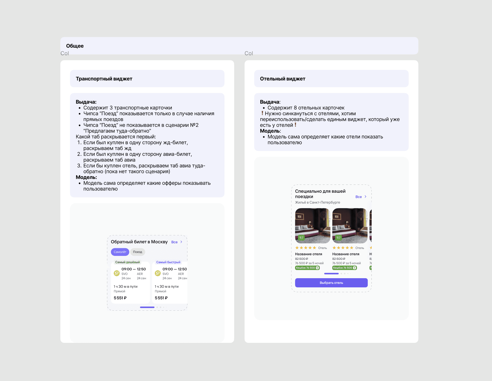
Summary flow design
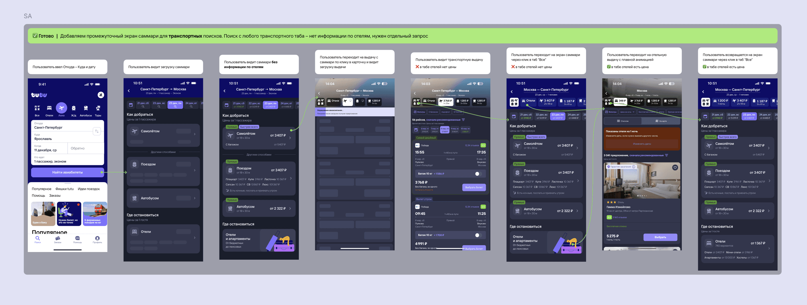
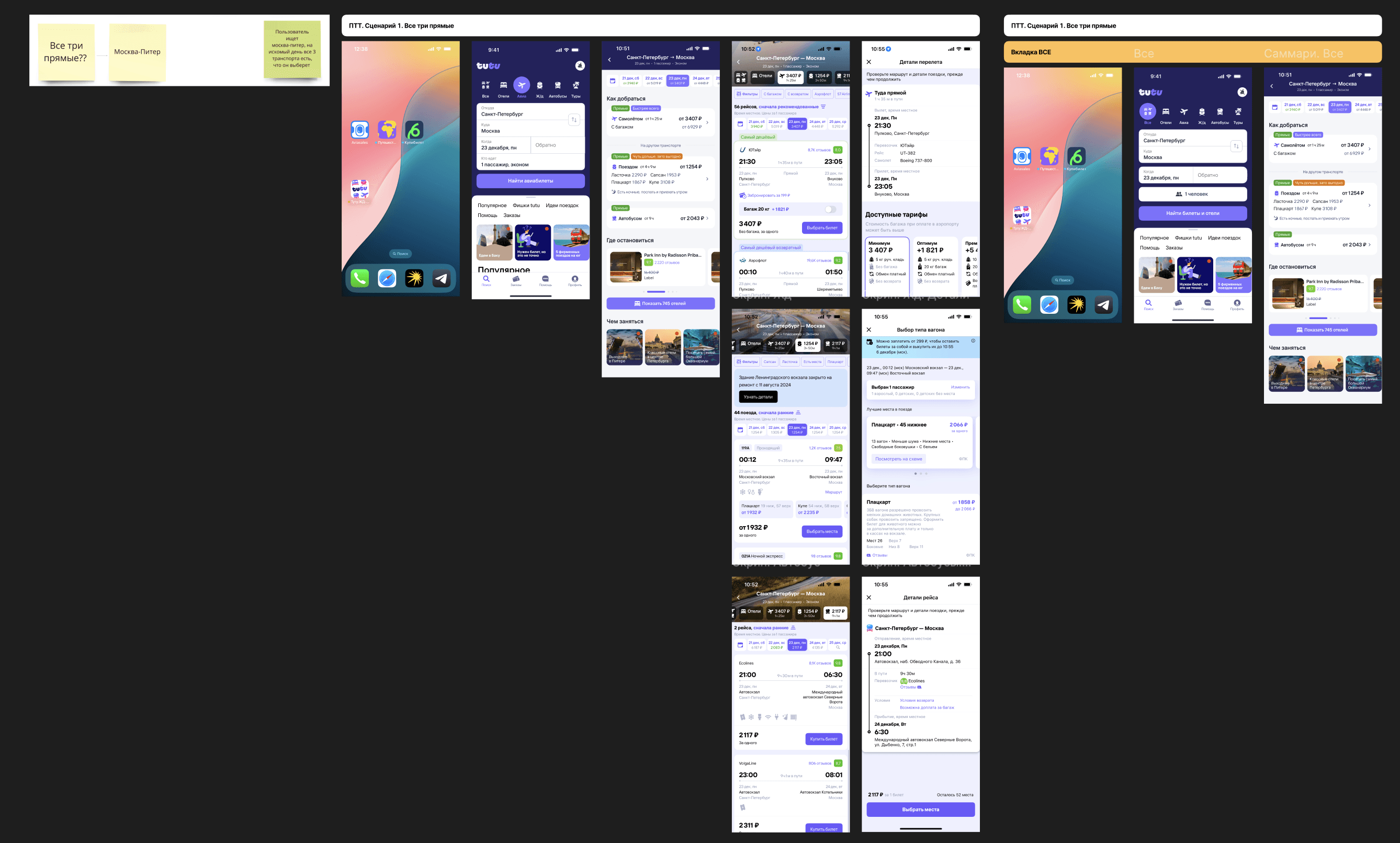
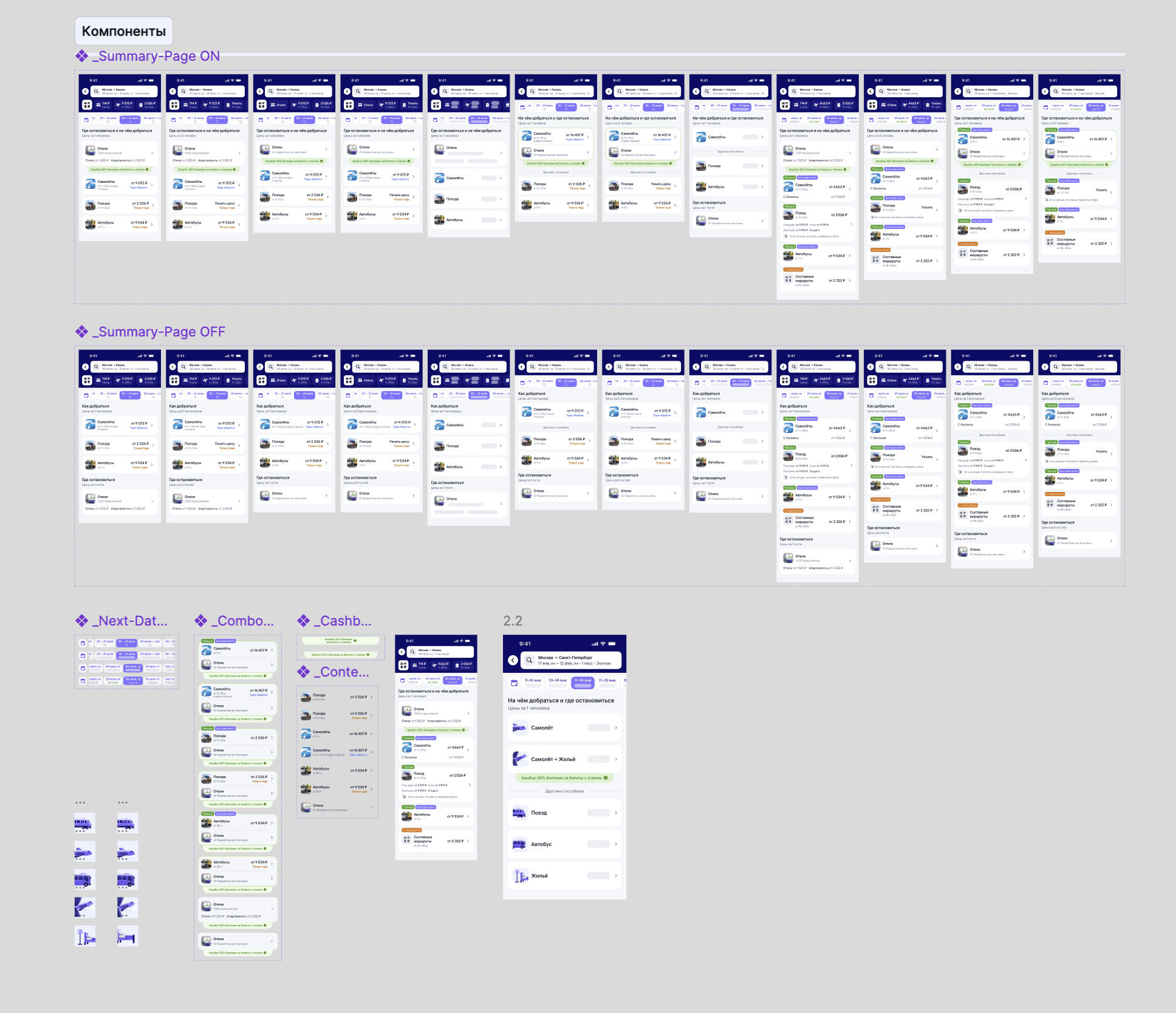
We introduced a Summary screen between search input and results, presenting transport options with key parameters.
The main trade-off was between added friction and increased value. To mitigate this, the screen was designed to be skippable: users can immediately proceed by clicking on any transport card, even during loading.
We implemented partial loading with skeleton states to handle different response times while maintaining interactivity.
The selected transport is prioritized to preserve user intent, while alternatives are shown as secondary options.
Hotels are positioned lower in the hierarchy to maintain trust and avoid disrupting the main task.
Cross-platform behavior was tested, and a linear navigation model proved more intuitive and was adopted.
This is a basic summary flow
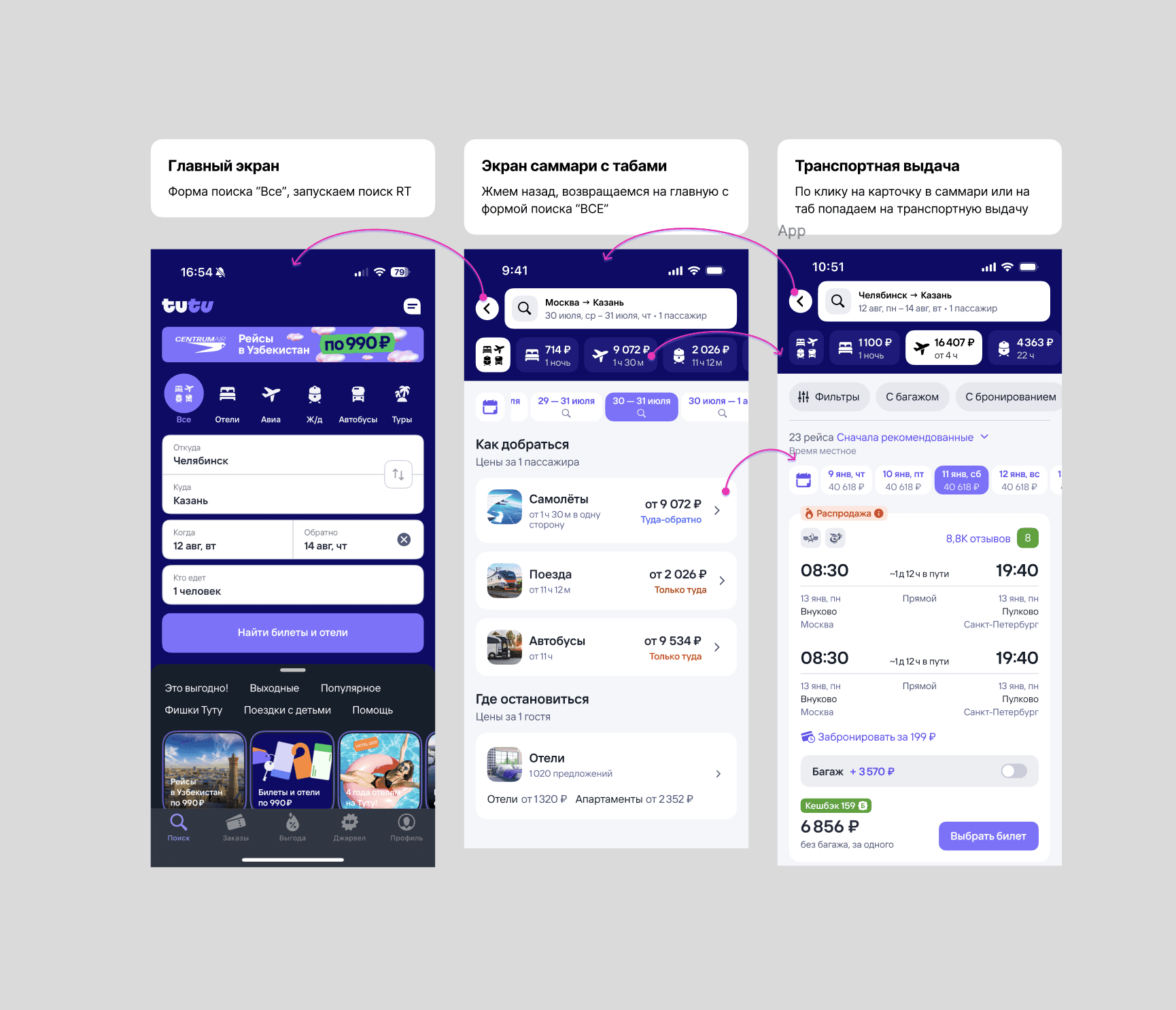
And all the flow types for summary
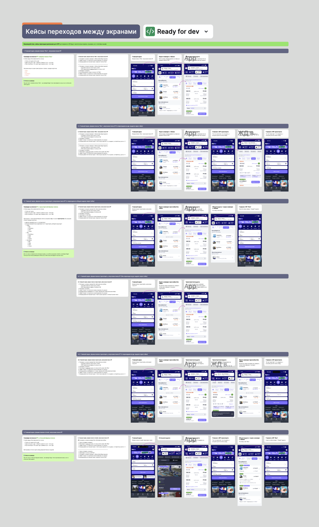
I created a template for a summary page, based on summaryCard product component
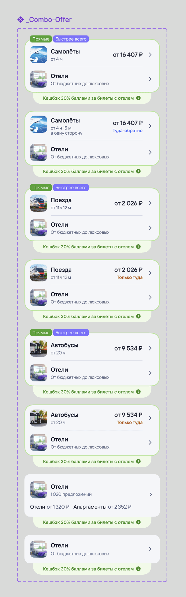
Combo bundles
In addition to the core Summary experience, we explored ways to integrate cross-sell more natively into the decision-making process.
For scenarios where promotional mechanics were available, I proposed introducing combo bundles that combine transport and hotel into a single offer. These bundles clearly communicate the value of purchasing both products together by showing the cashback the user would receive.
This approach allows cross-sell to feel less like an additional step and more like a beneficial option embedded into the primary decision flow.
Combo bundles became an important direction for evolving Summary, helping increase cross-purchases while maintaining user trust by making the value explicit and transparent.
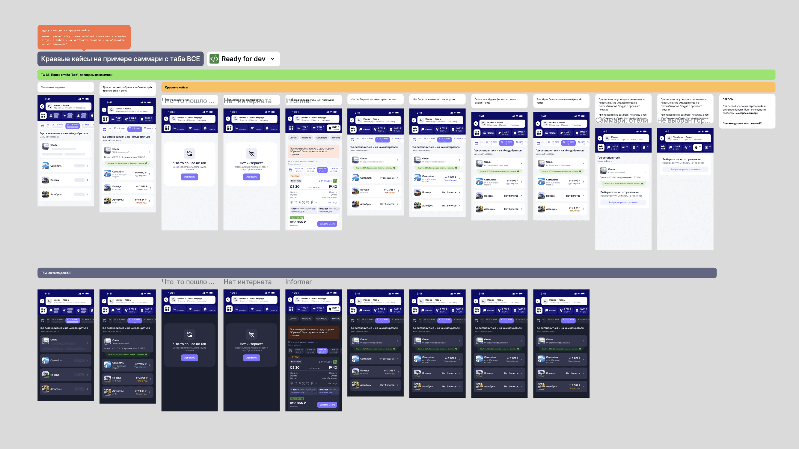
Edge cases
The screen supports multiple edge scenarios without becoming a dead end.
When data is loading, skeleton states are shown, but interaction remains available. When certain transport options are unavailable, they are either omitted or explicitly labeled.
If no direct routes exist, the screen surfaces alternative ways to complete the trip. When only one option is available, multimodal transport combinations are предложены.
For broader searches, results are ranked by route optimality.
Results and metrics + impact on product strategy
The introduction of Summary did not negatively impact core metrics: overall conversion and ARPU remained stable.
User behavior shifted significantly. The share of cross-users increased by +7.7%, and conversion into cross-purchases grew by +3.45%.
Conversion to results decreased by 7%, reflecting a behavioral shift: users began making decisions earlier, without opening detailed results.
Summary became an early decision layer and a scalable entry point for cross-sell, enabling bundled offers and supporting the transition to a travel marketplace.
Expanding cross-sell beyond Summary (Next Best Offer)
While Summary improved cross-sell at the search stage, we also explored how to extend this behavior across the rest of the user journey.
We introduced the Next Best Offer widget, a contextual recommendation component shown after key actions such as booking transport or reserving a hotel. The widget suggests complementary products and appears at multiple touchpoints in the flow.
This solution builds on the same principle as Summary, helping users complete their trip at a later stage of the journey.

The widget demonstrated strong results. Conversion from impression to order increased by +6.6%. Revenue increased by +32.6%, and ARPPU increased by +22.3%. Conversion from product view to booking increased up to +35.6%.
These results show that cross-sell is most effective when designed as a system of touchpoints across the entire journey.
Next steps
Further improvements include standardizing navigation across platforms based on the validated linear model, improving ranking logic for certain transport types, and increasing the visibility of hotel offers without compromising trust.
In the long term, Summary can evolve into a personalized decision layer, using user context and preferences to further reduce cognitive load and improve conversion.