

Key Achievements
Proposed replacing achievement images with unique recipes from the Magnit Magazine, resulting in a 50% increase in the Magazine's Monthly Active Users (MAU) in December
Increased CR to success game completion by 91%
Introduced navigation (burger menu), leading to a 22% increase in the visitation of pages explaining the game mechanics
Suggested creating an additional entry point for the game giveaway, resulting in a 37% increase in conversion to the giveaway page
Completely restructured the components of the gaming section into a design system, reducing the time-to-market for each promotion and easing the workload for the product designer and frontend developers
After the redesign, the amount of negative feedback on our promotions in social media decreased
Devised and defended the idea of separating game mechanics into a simple part of the game (one-click) and a record-breaking game, doubling retention in both aspects of the game
Business Objectives
The redesign aimed to achieve the following business objectives:
Automate launches and reduce Time-to-Market (TTM).
Increase the number of participants in giveaways.
Boost additional margin from each promotion.
Address UX issues.
At the start of the project, Magnit had already launched three games. UX problems were being identified for each game through various communication channels and within the promotions themselves. Support staff documented issues, our researchers found insights on social media, and interactions with users during user days provided valuable feedback.
All this information was consolidated into a Customer Journey Map (CJM), which we referred to while immersing myself in the task.
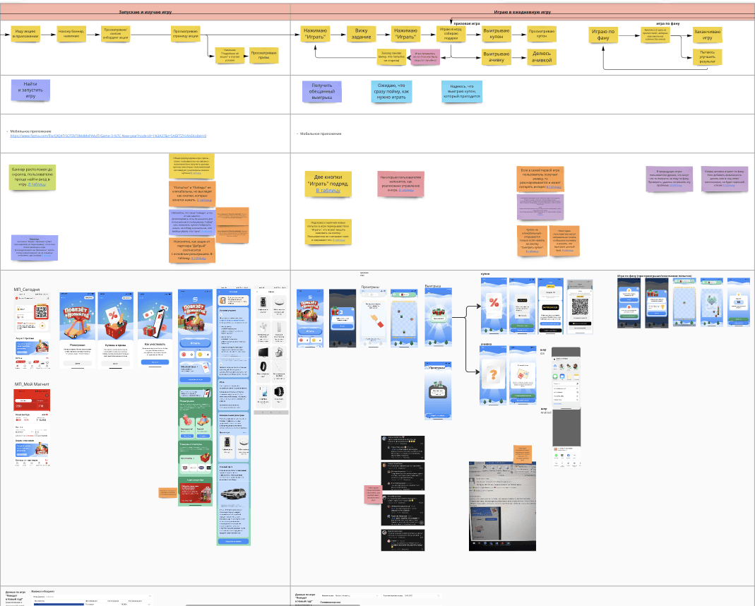
Primary UX Issues Faced by Users
Users have incomplete understanding of what game attempts entail.
Unclear process for obtaining paid attempts.
Lack of clarity regarding the difference between free attempts (provided daily for users to try the game) and paid attempts.
Users struggle to comprehend the rules of the promotion, facing difficulty in locating them. Even if found, the rules often contain complex text that is challenging to grasp.
Here is how the templates for game mechanics looked before the redesign. For a comprehensive list of issues and analysis, refer to this link.
Design Tasks
Based on the business goals and identified problems, I formulated design tasks and prioritized them.
Transition to the Gaming Design System (DS): Restructure the process of transitioning to the gaming DS and redesign templates based on insights into current issues. Given the consecutive launches, a systematic approach to organizing gaming elements without disrupting existing functionality was crucial.
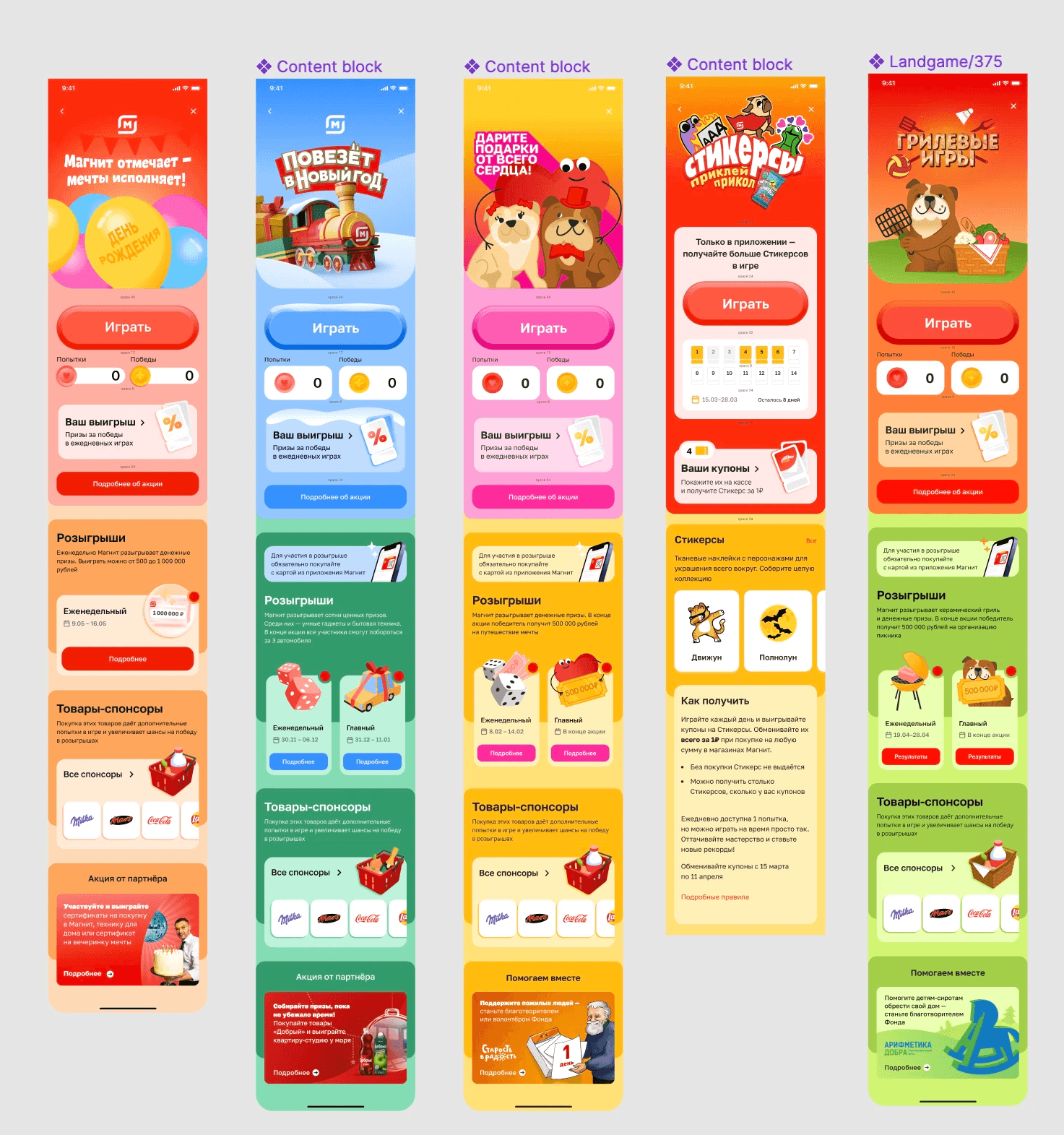
Highlight Giveaways: Devise a way to more prominently showcase giveaways to users, as less than 10% of the game's audience was participating in them.
User Engagement: Explore methods to engage users in the games, encouraging them to spend more time playing and incentivizing additional attempts through purchases at Magnit.
User Intent: Investigate whether users want to actively play games or are primarily interested in receiving coupons and going about their activities.
Non-Monetary Motivation: Develop alternative non-monetary incentives for users to play games, considering the limited budget for product coupons. Users were dissatisfied with achievements as they didn't see their value; hence, exploring other motivating factors was essential.
Key Product Hypotheses
Main hypotheses that arose and needed validation:
Users playing our games might also engage in hyper-casual (non-marketing) games, and representing the internal currency (in our case, attempts) similarly to other games may enhance readability.
Placing the giveaway entry point directly on the cover might increase visibility, encouraging users to notice and participate.
The addition of a menu (burger) could facilitate easy navigation through promotional information pages, aiding users in finding rules, giveaway results, etc.
A Frequently Asked Questions (FAQ) page might enhance transparency about the mechanics.
Users may not fully understand the value of the game, but a brief text with a clear Call-to-Action (CTA) could improve comprehension.
To assess user interest in playing, launch an experimental game with different mechanics for obtaining prizes. If users prefer a simple one-click action over a more engaging game, it indicates a preference or dissatisfaction with the current approach.
Users may be more satisfied with receiving a content-based achievement with useful information rather than an image with no inherent value.
Prototype Preparation for Qualitative Research - Design Iteration 1
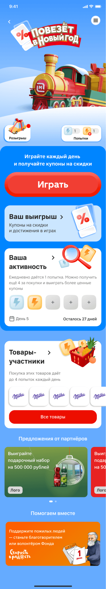
To validate hypotheses through qualitative research, I prepared three new approaches for the main campaign page. The designs introduced a menu, a giveaway entry point, a gamified block with attempts, and the ability to track progress by day.
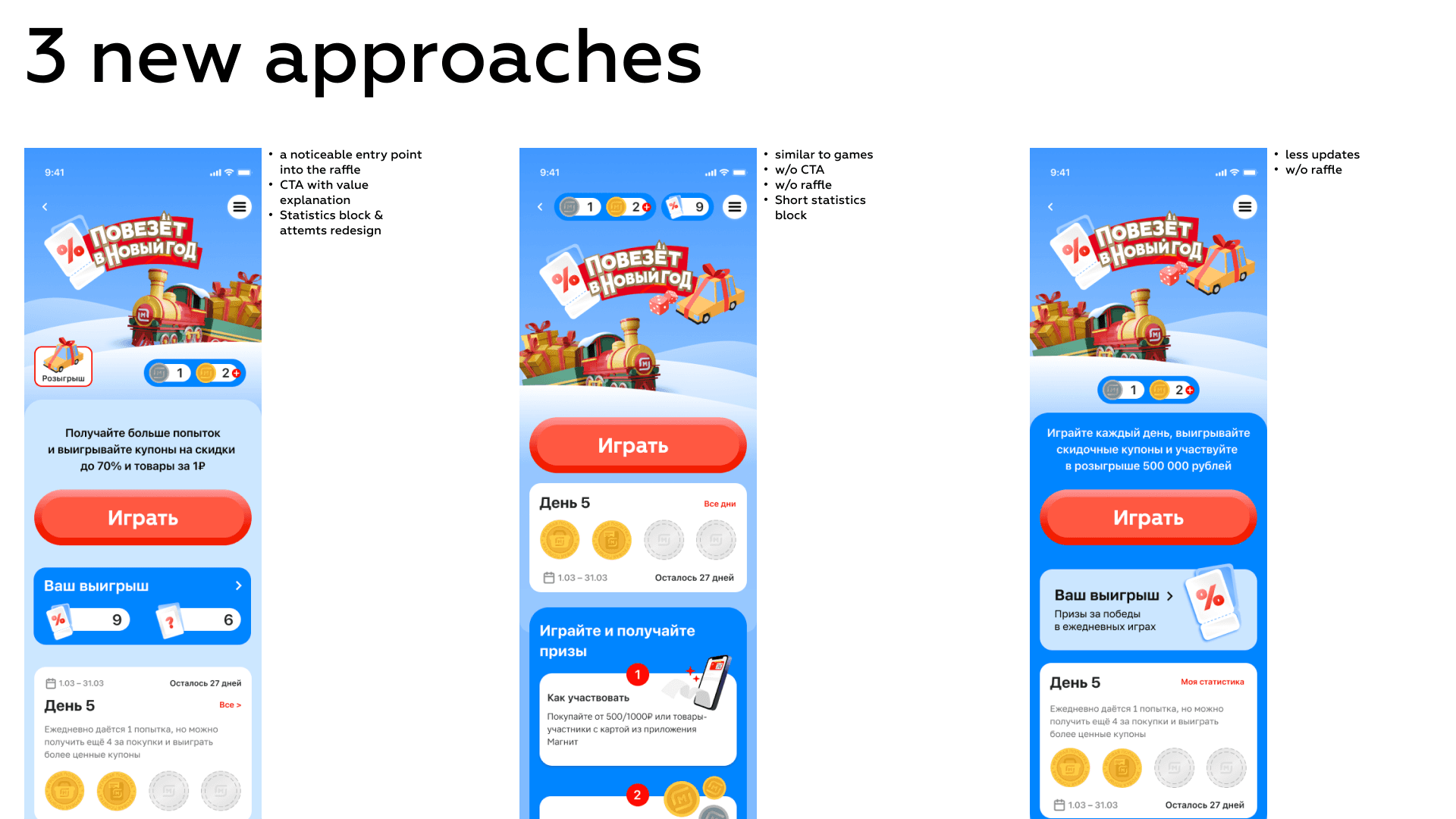
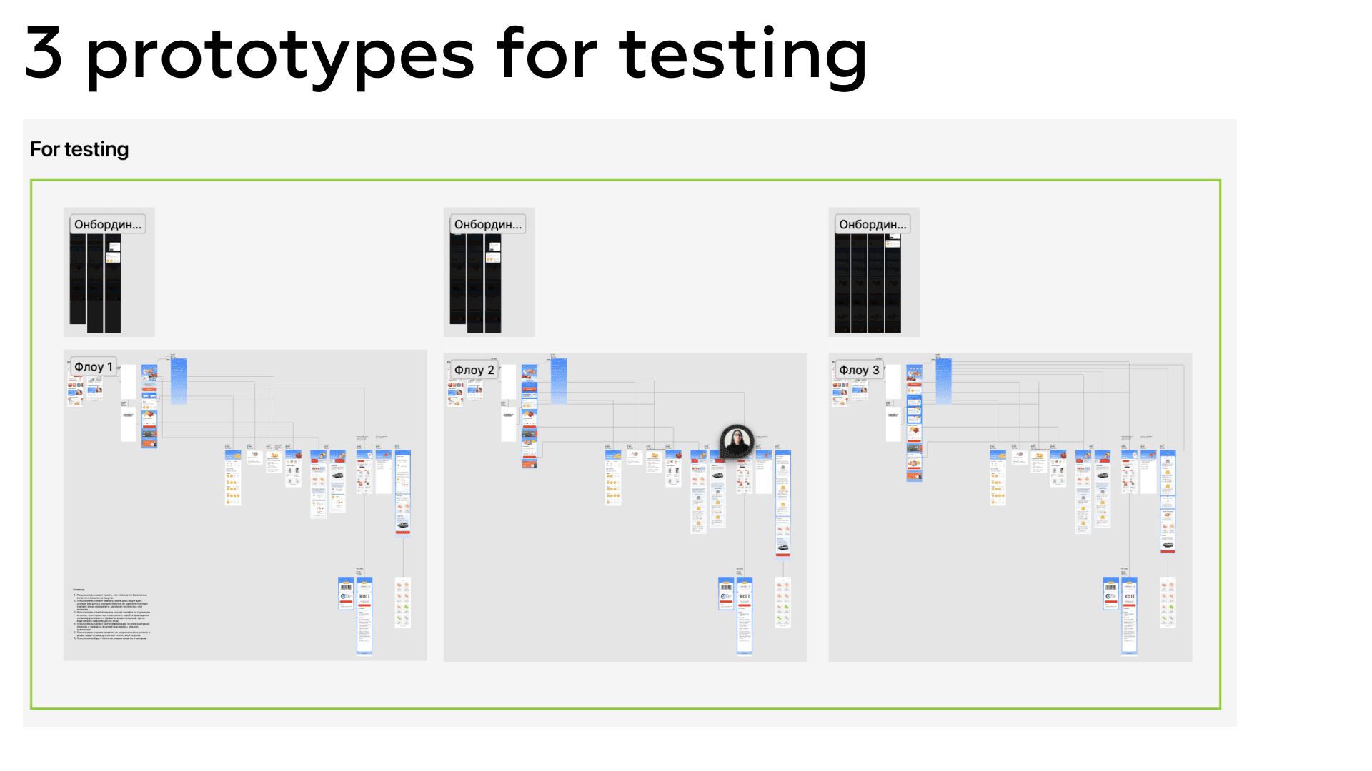
For each of the approaches, we created a separate flow and prototype for conducting the research. You can view the prototypes here.
Qualitative Research insights
Сonducted qualitative research, collaboratively designed the study, and prepared questions and hypotheses for each new flow separately. Interviewed 9 respondents, divided them into 3 groups, showing each group 1 of the 3 prototype variants.
Key research findings:
7/9 easily found the menu and navigated through the pages within it.
5/9 clicked on the attempt icons and noticed the difference in descriptions.
3/3 noticed the giveaway entry point and entered.
8/9 correctly understood and could explain the promotion mechanics.
Key hypotheses regarding page structure were confirmed.
Full results and insights from the research are compiled here.
Design Iteration 2 After Research
Based on the research, we identified the leading variant in terms of user convenience and incorporated good solutions from other tested prototypes.
Additionally, it became clear from the research that the visual representation of attempts confused users. Our task was to clearly communicate that free and paid attempts differed. To obtain an attempt, users needed to make a purchase of at least 500 rubles or buy participating promotion items. Initially, the communication designer had the idea to visually show the difference between paid attempts (separate visuals for a receipt attempt and a coupon attempt), but users found this confusing. Therefore, the visual representation of attempts also changed in the new version.
Here's how the engagement metrics for the promotion page grew compared to last year's New Year launch.

Retention rate to the action in comparison to a NY action a year ago (NDA, can discuss on a call)
New Approach to Games
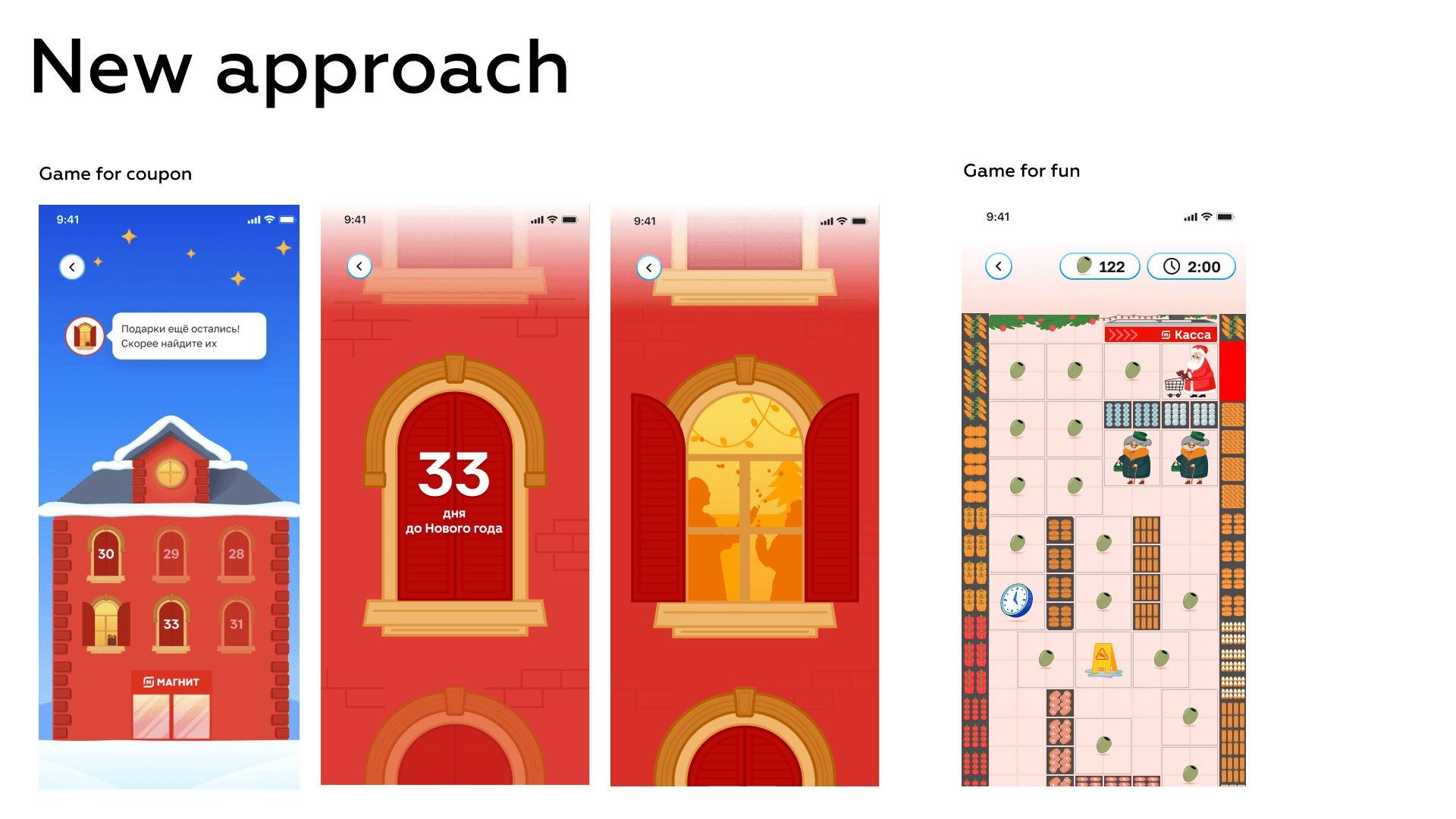
In the previous games, users engaged in the same gameplay, and winning a prize required 2-3 actions within the game.
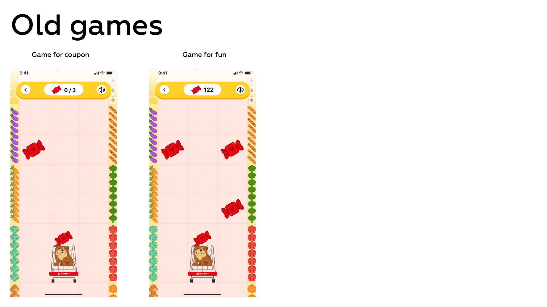
For the New Year's game, we suggested to simplifying the coupon game. As a mechanic, we chose an advent calendar, where users simply open a window and receive a prize. The fan game, on the other hand, resembles the mechanics of Pac-Man. Users need to collect New Year's food items for the festive table.
Retention rate to the game in comparison to a game a year ago (NDA, can discuss on a call)
User Feedback from Our VK Community
Here's the feedback we received from users in our VK group.
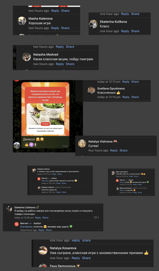
From this, we can conclude that users indeed want to play, while obtaining a coupon can be achieved with a simpler mechanic, which we will continue to use in future launches.
Results of Game Mechanics Changes
As a result, retention in both games increased approximately twofold (the figures will be slightly adjusted at the end of the promotion, so the graph shows retention higher).
Another Innovation - Recipe Achievements
As I mentioned earlier, we aimed to provide more value to users by introducing more useful achievements. We integrated with our gastronomic magazine featuring recipes and awarded achievements in the form of a unique recipe.
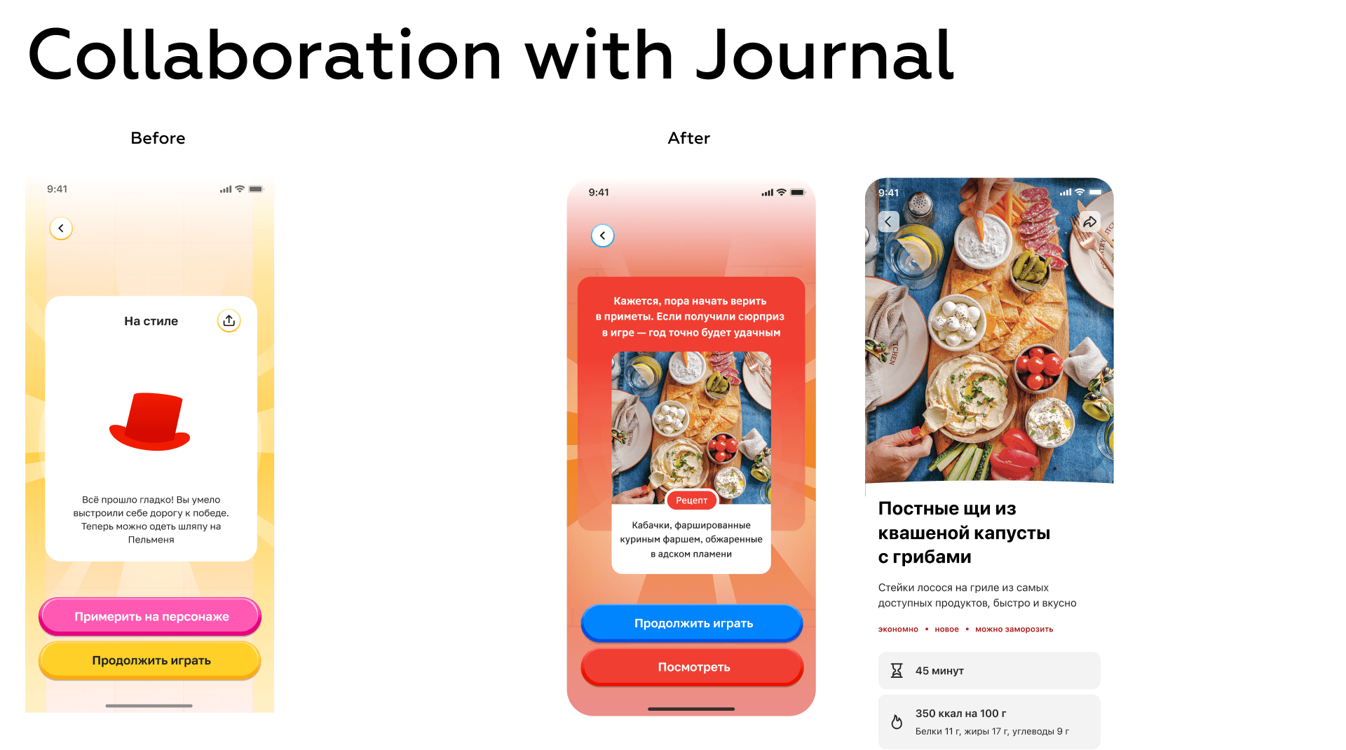
In the end, we managed to increase traffic to the magazine by 20%. This signifies that we successfully engaged users with new types of achievements and promoted another content product for Magnit. Since our audiences did not overlap, this integration not only helped them gain new users but also benefited us, as the magazine featured compilations with New Year recipes with an entry point to the game.
Design System for Games
This task is still in progress, but many pages have already been converted to components, and we are synchronized with development. We are creating a storybook together and are already spending 20% less time setting up a new game using the template.
Results
All design tasks were successfully completed. Users provided positive feedback, business stakeholders were highly satisfied, and most of the key metrics that we aimed to increase saw improvement.
Reiterating the Key Achievements Block
Suggested providing unique recipes from the Magnit Journal instead of achievement images, increasing the Monthly Active Users (MAU) of the magazine by 50% in December
Increased CR to success game completion by 91%
Introduced navigation (burger menu), increasing the visitation of pages explaining the game mechanics by 22%
Proposed an additional entry point to the game giveaway, increasing the conversion to the giveaway page by 37%
Completely rebuilt the components of the gaming section into a design system, reducing the time-to-market for each promotion and reducing the workload on the product designer and frontend developers
Reduced the amount of negativity on social media regarding our promotions after the redesign
Devised and defended the idea of separating game mechanics into a simple part (1 click) and a record-breaking game, doubling retention in both games